
Designing for Minimalist Interfaces – Crafting Calm in Chaos
In a world overflowing with digital noise, simplicity beckons. Enter minimalist design – the art of crafting sleek interfaces that prioritize essential elements, clarity, and user experience. It’s not about stripping down to bare bones; it’s about deliberate choices that enhance functionality and evoke a sense of elegance.
Less is More, But What Less?
Minimalism starts with a ruthless edit. Identify the core purpose of your interface and ruthlessly trim the fat. Every element, every pixel, must earn its place. Ask yourself:
- Does it contribute to the user’s goal? If not, it’s clutter.
- Is there a simpler way to convey the same information? Opt for conciseness.
- Can multiple elements be combined into one? Streamline the experience.
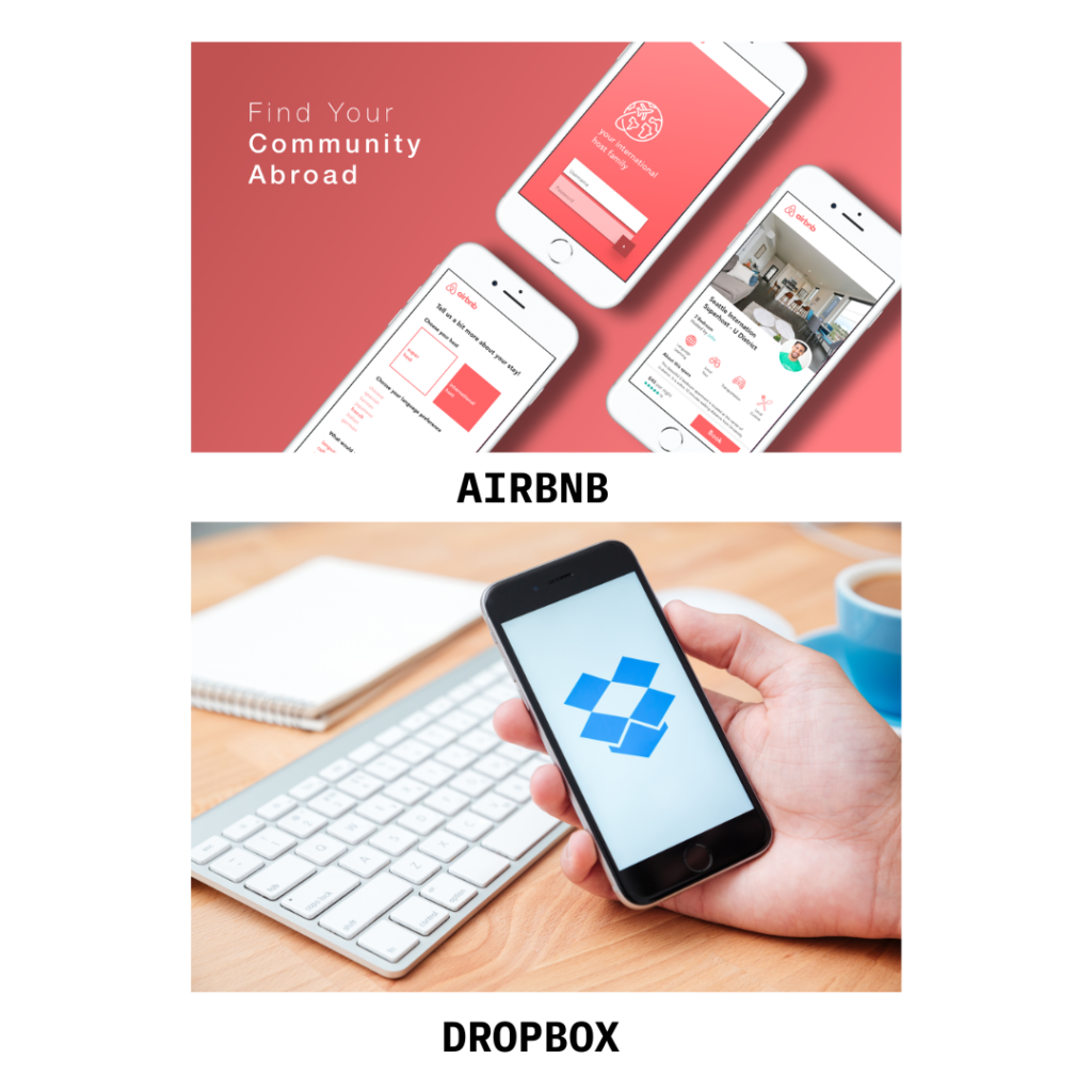
Examples of Minimalist Magic:
- Airbnb: Their clean interface removes distractions, letting stunning photos and concise descriptions guide users towards their perfect vacation experience.
- Dropbox: Simple drag-and-drop functionality removes friction from file sharing, making it effortlessly intuitive.
- Spotify: Uncluttered music browsing with large album art and minimal text prioritizes discovering and enjoying music.
The Symphony of White Space:
Whitespace, the unsung hero of minimalism, gives elements room to breathe, enhancing visual hierarchy and readability. Imagine a room cluttered with furniture versus one with strategic empty spaces – the latter feels calm and inviting.
- YouTube: Generous whitespace around video thumbnails prevents overwhelming users and improves scannability.
- Google Search: The vast white canvas with a single search bar emphasizes the user’s intent, conveying power in its simplicity.
- Apple Watch: Minimal watch faces with clear icons and data points prioritize glanceable information, perfect for on-the-go needs.
Beyond Aesthetics: Usability Reigns Supreme:
Minimalism isn’t just about eye candy; it’s about creating interfaces that are intuitive and effortless to use. Interaction cues should be subtle yet effective, guiding users without overwhelming them.
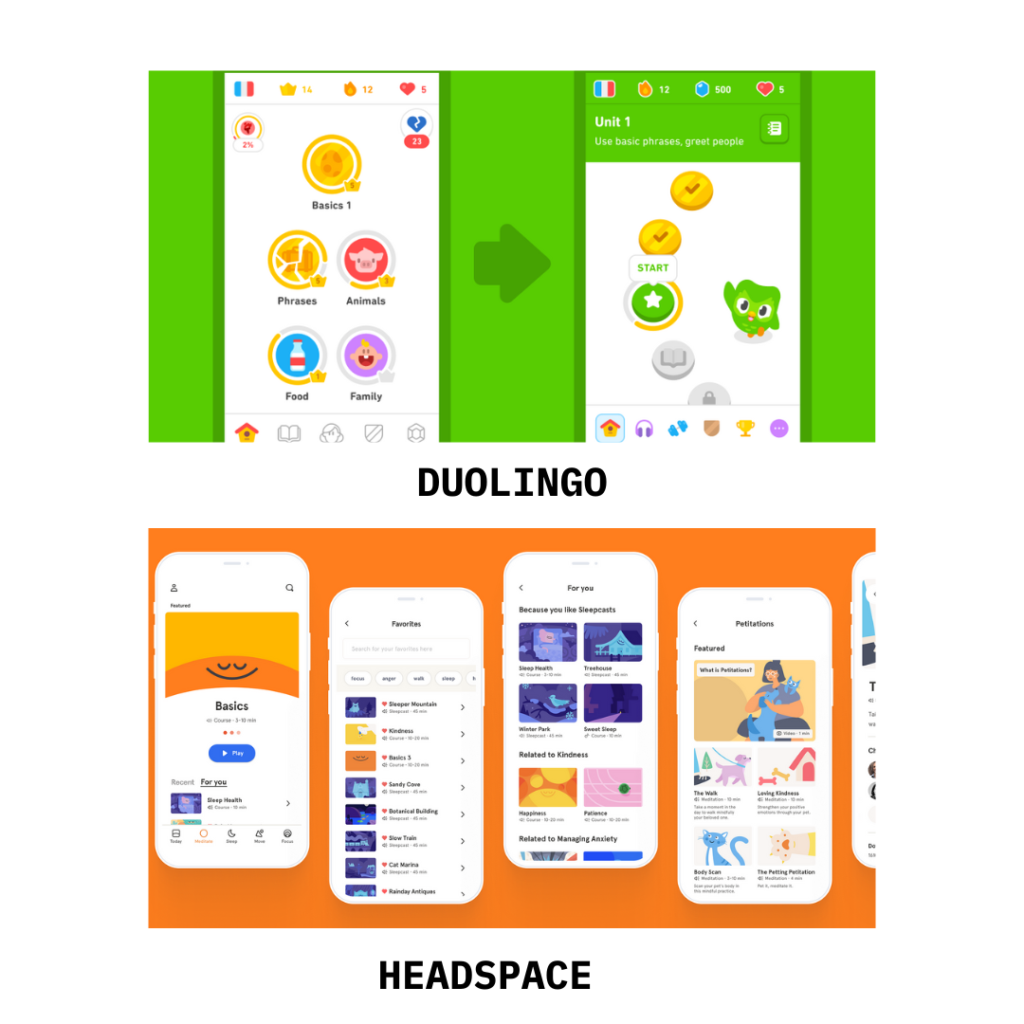
- Duolingo: Simple icons and gamified progress bars in their language learning app encourage users to keep practicing without needing complex instructions.
- Slack: Their intuitive text channels and emoji reactions enable seamless communication without cumbersome menus or buttons.
- Headspace: Minimal animations and calming color palettes in their meditation app create a focused and serene environment for mindful practice.
In conclusion, Minimalism is a Philosophy, Not a Formula:
While principles guide the way, remember – minimalism is not a rigid formula. The key is to understand its core values – clarity, intentionality, and user-centricity – and apply them creatively to your unique context.
Also Read : How to create Task Management Database – Streamline your workflow
Check out – Flexlists : It provides data management and app integration services. It offers a variety of features to help users organize, manage, and share data in a easy way.
By embracing the art of sleek interfaces, you can carve a path through the digital jungle, offering users a haven of calm, efficient interaction. So, let your design choices be deliberate, let whitespace sing its praises, and most importantly, let usability reign supreme. In the end, you’ll find that less is truly more, creating interfaces that are not just aesthetically pleasing, but also functional works of art.